Spotify Library Experience
A UX redesign focused on simplifying playlist management by reducing friction in everyday listening.
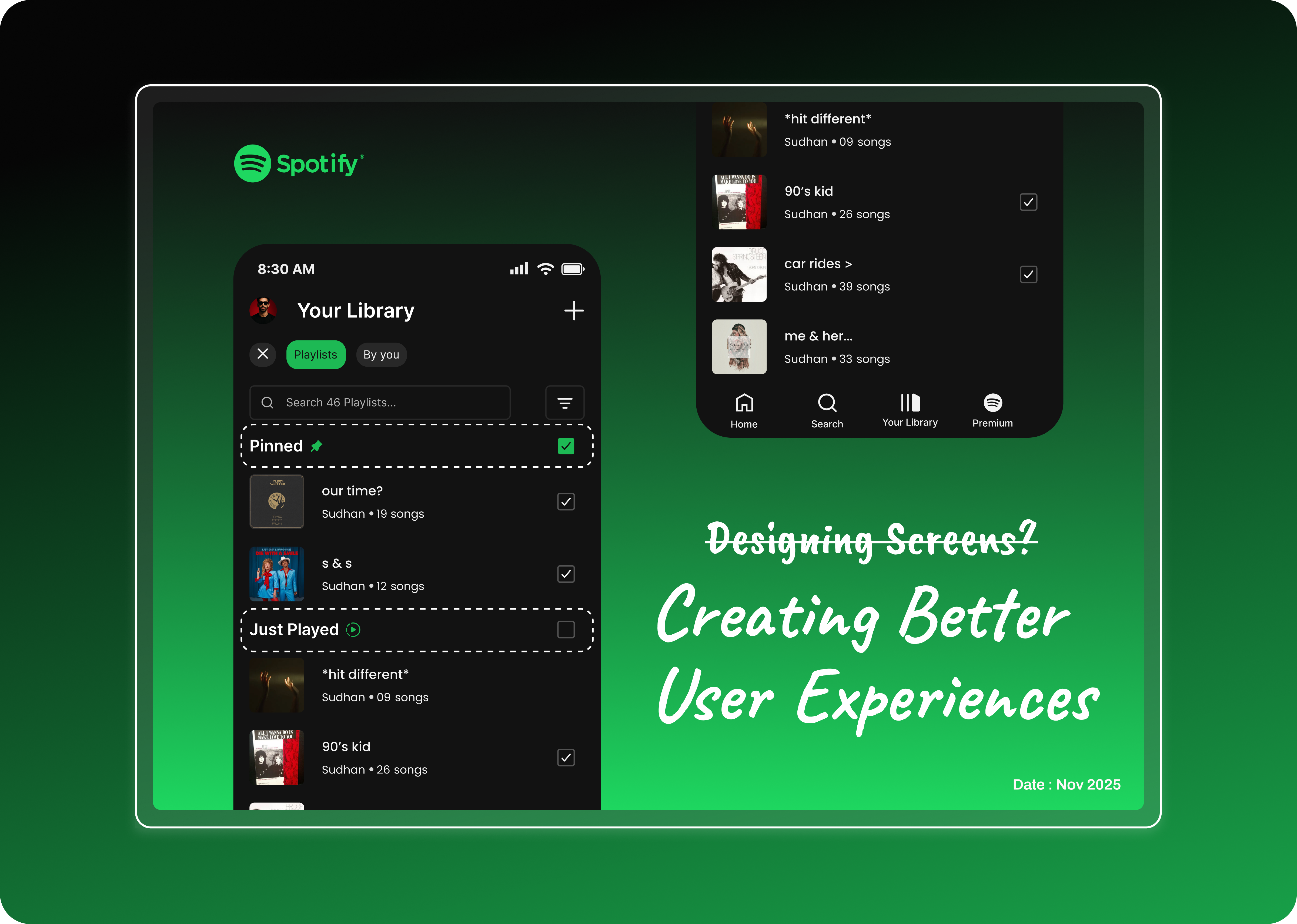
Overview
Small friction, every single day
Spotify is one of the world's most-used music-streaming platforms, but even mature products can contain small usability issues that affect everyday interactions.
While observing my friend Sierra, I noticed the frequently managed playlists each visit unnecessarily repetitive. Although these issues were minor individually, they accumulated into a slower experience for someone who used Spotify every day.
Rather than redesigning Spotify's visual language, I focused on improving the Library experience through small, meaningful UX enhancements that respected the existing product.
Meet Sierra
A friend who inspired me to rethink how we manage playlists when our music keeps growing.
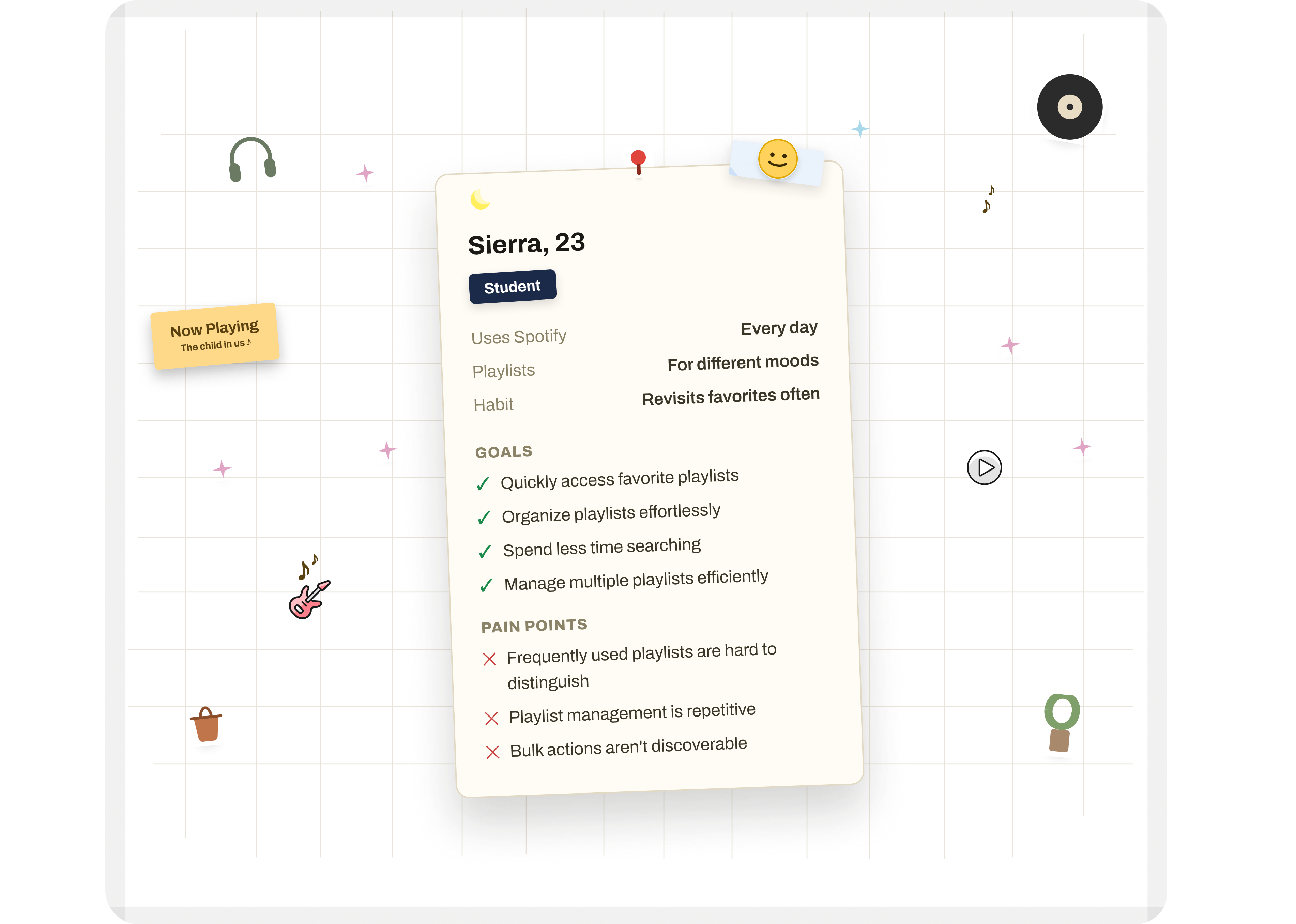
Small Frictions in Everyday Use
After observing Sierra's workflow, I identified several usability issues that interrupted an otherwise familiar experience. Instead of one major problem, the Library contained multiple micro-frictions that collectively increased the effort required to organize playlists.
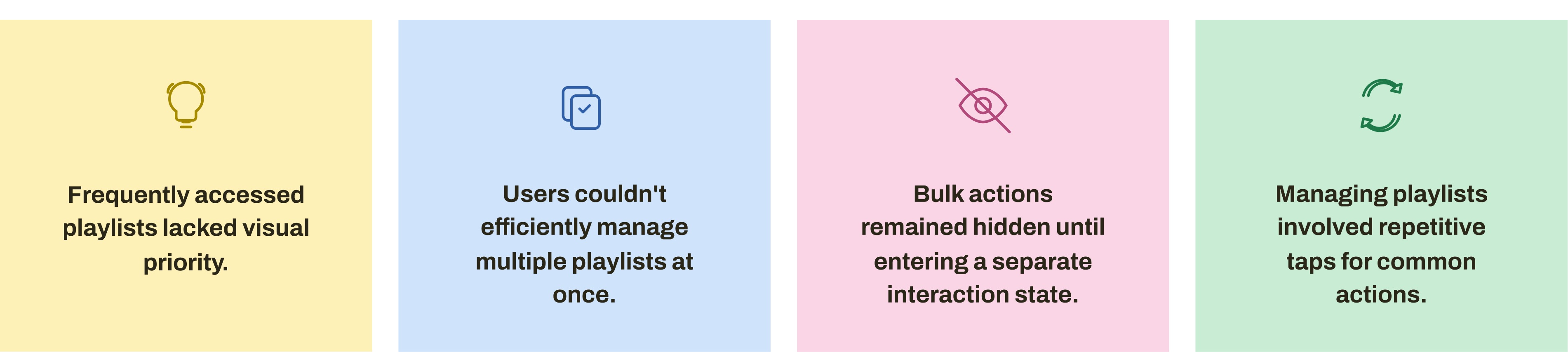
Reducing interaction cost
Rather than immediately redesigning the interface, I explored multiple ideas focused on reducing interaction cost while preserving Spotify's existing design language.
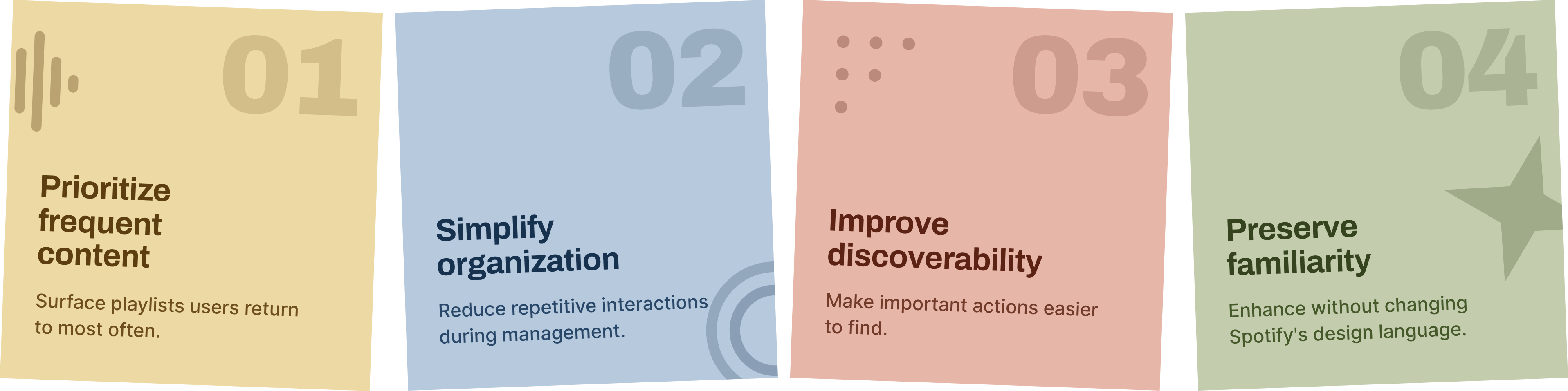
Three small changes, one smoother library
Each change targets a specific friction Sierra faced while managing her library - small on their own, but they compound into a noticeably tighter workflow.
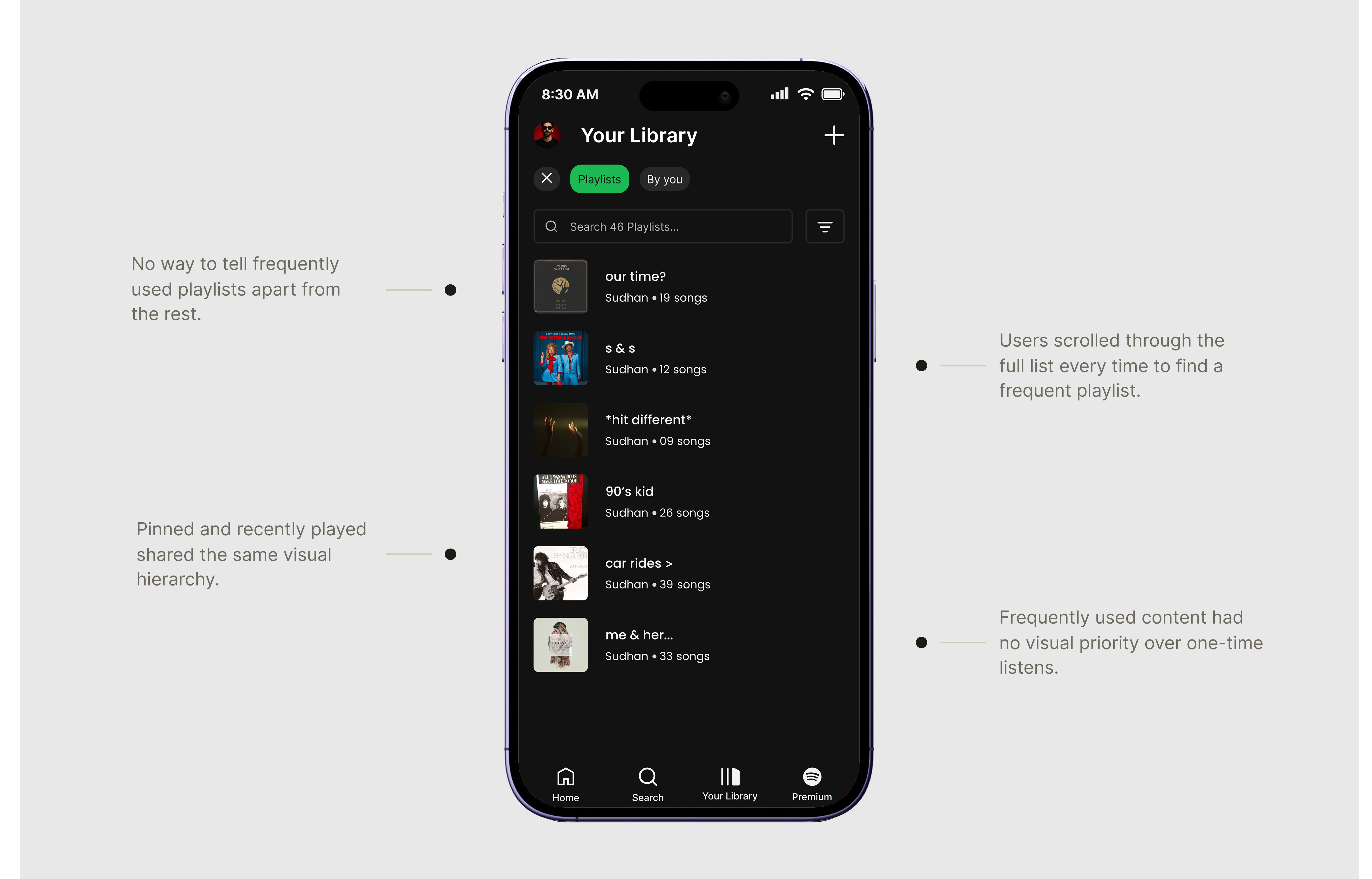
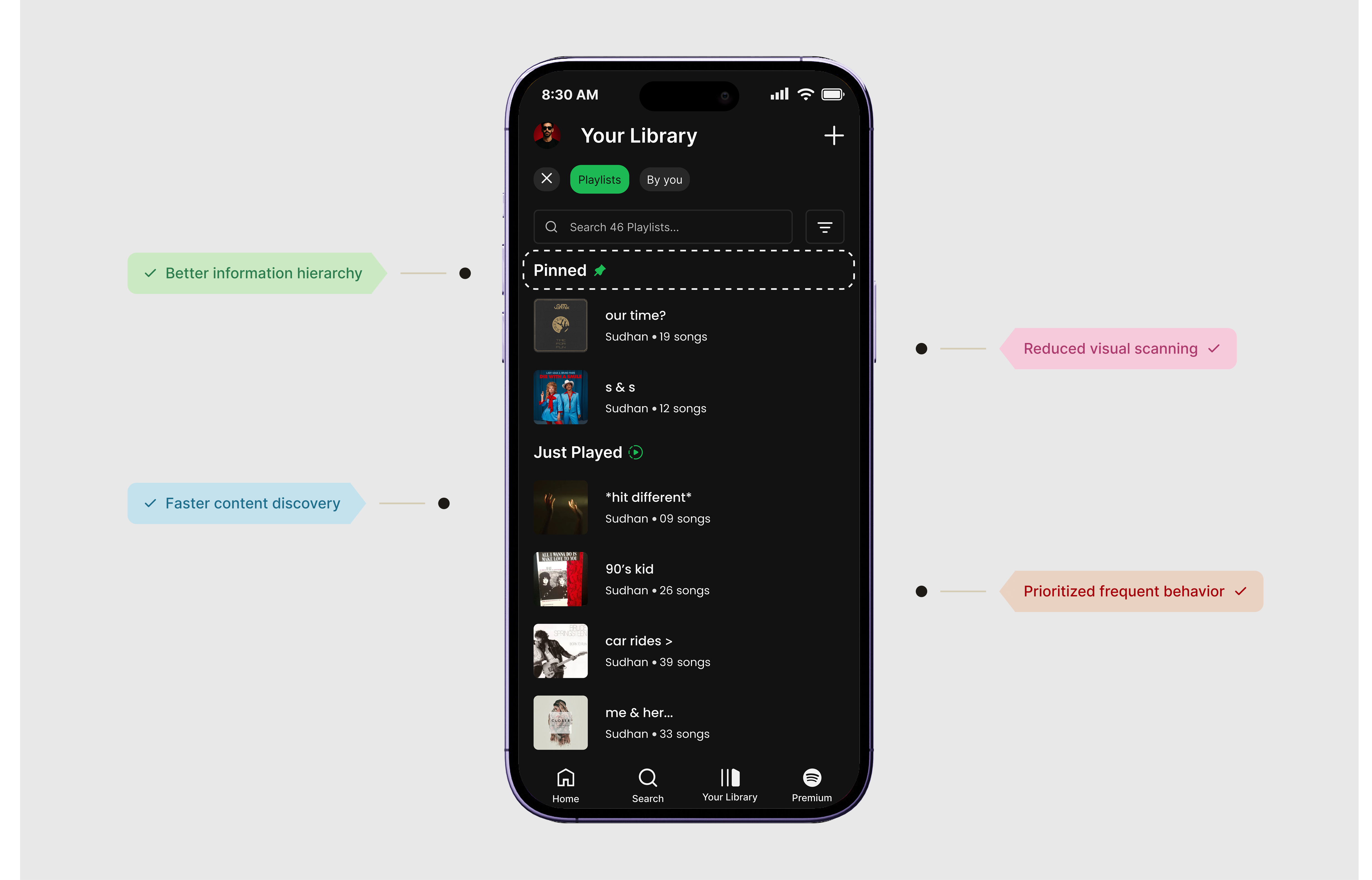
Separating Priority from Recency
Pinned and recently played playlists shared the same visual hierarchy, making important content harder to locate.
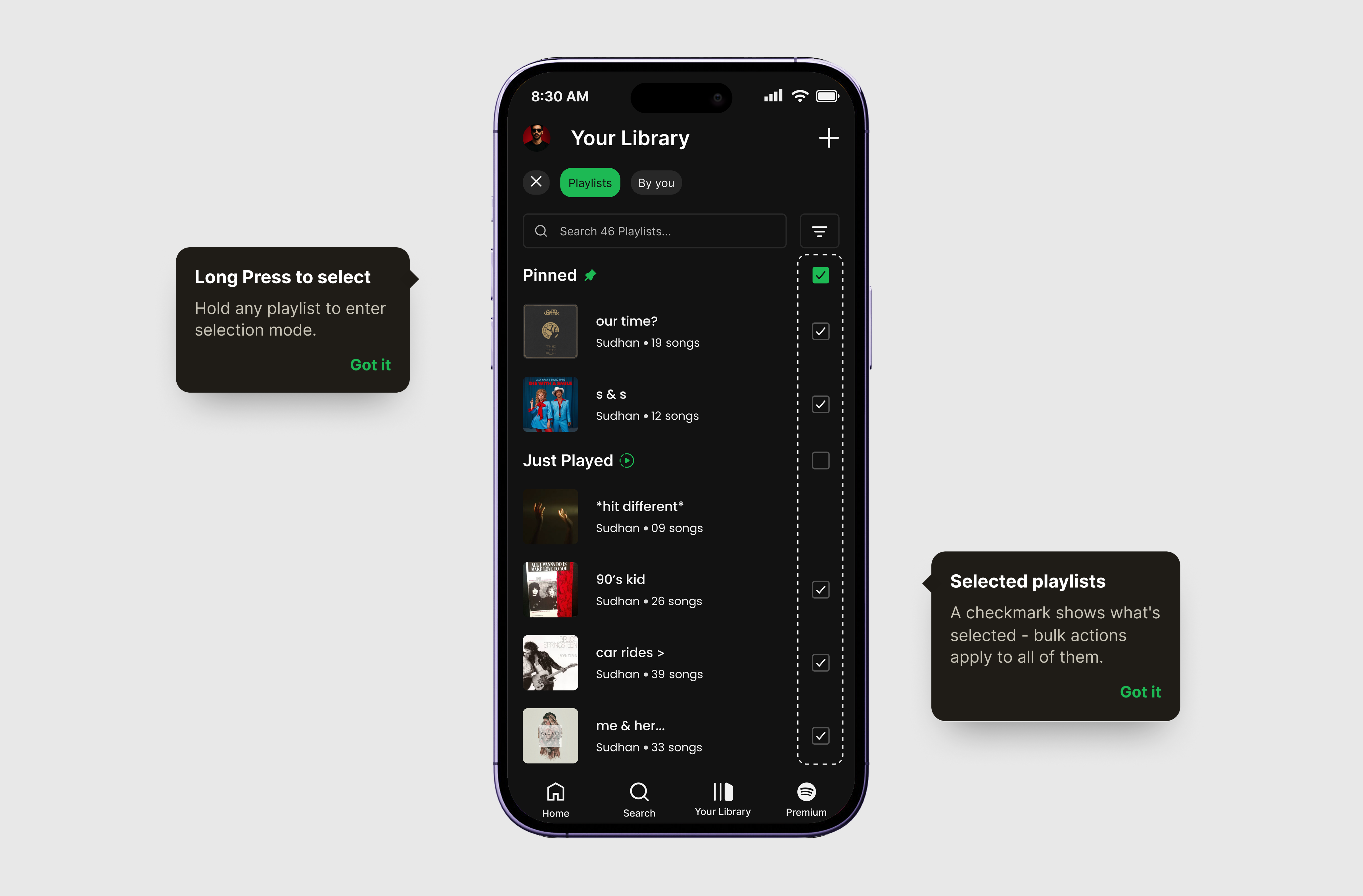
Enabling Multi-Selection
Managing playlists individually creates unnecessary repetition.
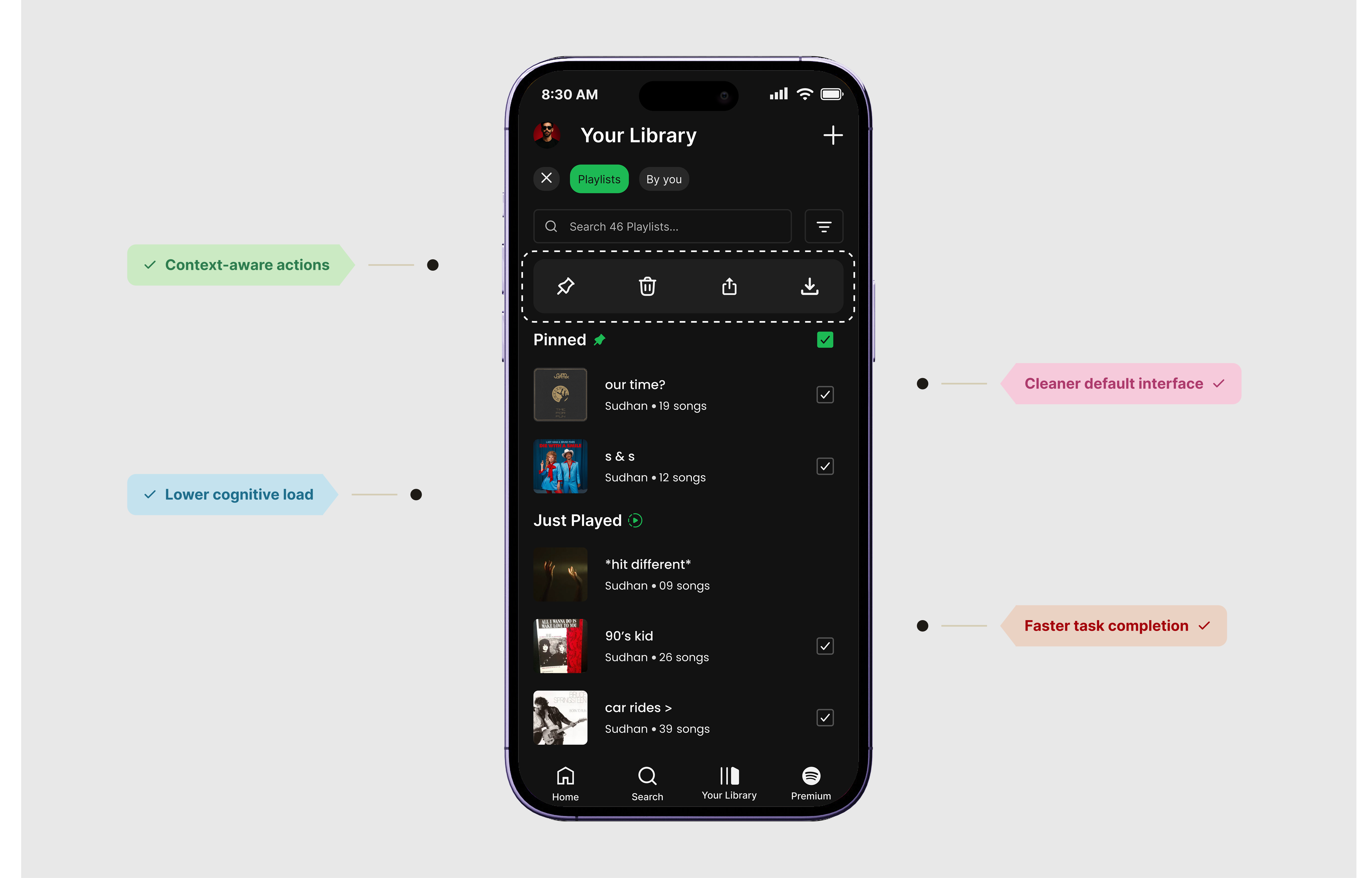
Contextual bulk actions
Playlist actions were separated from the selection workflow, requiring extra steps before actions could be found.
Feedback after testing the prototype
After presenting the redesigned Library, Sierra completed her usual playlist organization flow using the prototype.
The playlists I use every day are easier to find.
Managing several playlists finally feels straightforward.
It still feels like Spotify, just easier to use.
Impact doesn't always mean new features
This project reinforced an important lesson: impactful UX improvements don't always require introducing new features.
By observing a real user's behavior and focusing on everyday interactions, I learned that refinements — better hierarchy, fewer steps, contextual actions — can significantly enhance the overall experience while preserving what users already know.